Designing For Accessibility
Accessibility needs to be taken into consideration from the start of a project. Choices made in the design and planning phase can alter a sites accessibility before a single element has been developed. Typeface or Font, size and spacing, color, as well as motion play a role in ensuring a site is accessible. This may take a little more effort and feel restrictive at first but accessible sites can have great design. Understanding the guidelines will help stunning designs be enjoyed by more users.
Typeface or Font
There are no specific accessible font choices for everyone. But a few things should be taken into consideration when choosing a font. Legibility, readability, size and spacing. Google fonts has an in depth guide to accessibility in typography. opens in new tab
Legibility
Legibility has to do with how a particular typefaces glyphs can be correctly identified as characters and words and how they can easily be distinguished from one another. Common glyphs to examine would be the i l 1 and 0 O o. Counters or the white space within glyphs is another place to consider c o e . The more open the counters the easier it is to distinguish between letters. Bottom line, if we are having trouble distinguishing words or letters in a typeface then a person with visual disabilities may have even more difficulty.
Readability
Readability has to do with how easy it is to read the text overall. Mirror flipping and transpositioning are common in people with dyslexia and other reading difficulties. Common character pairs like the list below, can be checked to see if there is enough distinction. There is no right or wrong answer, ultimately readability is a judgement call. It also is affected by text size and letter spacing. Readability can be summed up by the overall ease it is to read content.
- qp
- db
- 0O
- nu
- il1I
- 69
- a8
- a6
- 6g
- rn, m
Text Size and Spacing
Text should be set in relative units such as REM or EM. With a minimum of 1 REM or the EM equivalent of base 16px for the body type. Larger Text should be a minimum of 1.5 REM or EM. Relative units are used to allow a user to change the zoom and font size of a webpage based on their preferences. WCAG requires that no loss of content or functionality occurs when the end user overrides page styles for paragraph spacing to 200% of the font size, text line height/spacing to 150% of the font size, word spacing to 16% of the font size, and letter spacing to 12% of the font size.
In addition to meet WCAG AAA requirements paragraphs also cannot exceed 80 characters wide and cannot be justified aligned. Justified as well as center aligned text is more difficult to read for most users and should be avoided.
Color
Color is very individual to brand but care needs to be taken with the contrats ratios between colors. Contrast ratios represent how different one color is from another. Too high or too low contrast can make text difficult to read. For WCAG AA rating Large text 1.5 REM+ and graphics requires a 3:1 ratio to the background. Small text 1REM requires a 4.5:1 ratio to the background.
For the AAA rating large text and graphics require 4.5:1 ratio and small text a ratio of at least 7:1. Too high contrast can also be an issue causing discomfort to many users, so avoid pure black on white or vice versa.
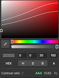
Webflow has a very handy color contast checker built into the color panel that provides the ratio as well as a color band with traced white lines indicating the range of AA and AAA rating. This makes it easy to confirm the contrast colors are within range.
When using text on a background image it can be hard to determine the exact ratio but one good safeguard is to use a color picker tool to find the lightest color the text would overlap and check the contrast ratio. It is also a good idea to use color overlays to enhance the ratio especially if the images are dynamic and colors may vary.
One general note on the usage of color. Color should NEVER be used as the only method of conveying meaning. There are several different types of color blindness and the ability to distinguish color also diminishes with age. There should always be text or another visual clue to inform the user in addition to color indicators for convenying important meaning.
Motion
Motion and animation should be used sparingly and with purpose. Flashing lights, text and motions can be harmful or distracting for some users. Options should be given to be able to play, pause and in some cases remove motion entirely using prefers reduced motion preferences.
Prefers reduced motion is CSS that can be employed to easily swap out lotties for static content and koalati has a script to apply prefers reduced motionopens in new tab to webflow animations on a whole. Being mindful of animations and motion is a further way that we design with accessibility in mind.