Security system
Video surveillance, burglar alarms around the perimeter of the house, modern access control system
parking
Change the text to see how this works
services
Video surveillance, burglar alarms around the perimeter of the house, modern access control system
elevators
Video surveillance, burglar alarms around the perimeter of the house, modern access control system
area
Video surveillance, burglar alarms around the perimeter of the house, modern access control system
windows
Video surveillance, burglar alarms around the perimeter of the house, modern access control system
fire alarm
Video surveillance, burglar alarms around the perimeter of the house, modern access control system
Accessible Accordion
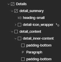
Details HTML Element
With Webflow's Custom Element we can leverage a native HTML element to build an accessible accordion without any JS as outlined by Andrew Bone on Dev.to. In webflow the basic structure is a details custom element containing a summary custom element and a div for content. Note the standard behavior for the detail element is to hide / show content instantly.
When using the details element in webflow once you add the summary the summary marker (arrow) will dissappear in chrome but be present in Safari, so we added a bit of code to hide the ::marker and create our own custom marker in webflow. In the basic example We have added a simple CSS opacity transition to affect the open close icon. We are using to replace the marker. That works on the details[open] attribute.
To be able to see the content in the designer you need to add the attribute open to the details custom element and give it a value. The you can style the content as needed.

<style>
/* hides the marker */
details summary::marker {
  list-style: none;
}

/* for safari */
details summary::-webkit-details-marker {
	display: none
}

/* sets the icon animation pure CSS can be adapted for any CSS animation */
.detail-icon_wrapper .icon-plus,
.detail-icon_wrapper .icon-minus {
  opacity: 0;
  transition: opacity 0.5s ease;
}

details[open] .icon-plus {
  opacity: 0;
}

details:not([open]) .icon-plus {
  opacity: 1;
}

details[open] .icon-minus {
  opacity: 1;
}

details:not([open]) .icon-minus {
  opacity: 0;
}
</style>
Details HTML Element Animation
If you are looking to create a smooth sliding accordion with the details element you will require some custom JS. This animation is based on the linkedlist: but modified to work with native webflow capabilities.
Animating the details element is a challenge as any official docs say it can't be animated. And after trying various workarounds we found one that works. By using CSS grid, and grid animation in custom properties. The structure differs a little from the base in that we have added an detail_inner-content div as well as padding divs on either side. If padding is applied directly to the detail_inner-content or detail_content there is a stuttering effect as the animation stops at the top padding and then closes instantly.
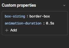
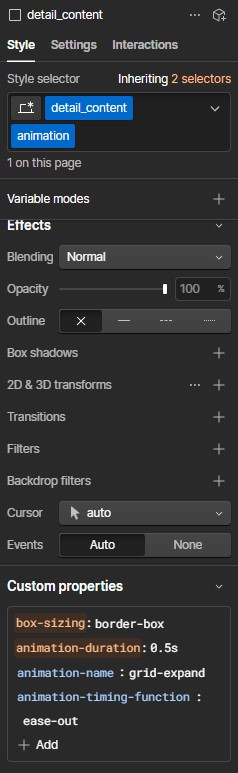
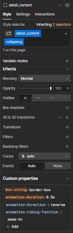
The first change from the basic details HTML element is to the detail_content div. The display is set to grid , overflow is hidden and animation-duration: 0.5s is applied to custom properties. Next we need two separate add on classes. they can be named anything but we are following the linkedlist .animation and collapsing . If you change the class names they will need to be adjusted in the javascript code.

For detail_conent with add-on class .animation add two more custom properties. animation-name: grid expand and animation-timing-function : ease-out. For detail_conent with add-on class collapsing add custom properties animation-direction : reverse and animation-timing-function : ease in
Next we need to add a bit more CSS to to add the animation in keyframes which sets the grid row from 0fr to 1fr
<style>
/* hides the marker */
details summary::marker {
  list-style: none;
}

/* for safari */
details summary::-webkit-details-marker {
	display: none
}

/* sets the icon animation pure CSS can be adapted for any CSS animation */
.detail-icon_wrapper .icon-plus,
.detail-icon_wrapper .icon-minus {
  opacity: 0;
  transition: opacity 0.5s ease;
}

details[open] .icon-plus {
  opacity: 0;
}

details:not([open]) .icon-plus {
  opacity: 1;
}

details[open] .icon-minus {
  opacity: 1;
}

details:not([open]) .icon-minus {
  opacity: 0;
}

/* add the animation matching the name to the animation-name set
in custom properties */

@keyframes grid-expand {
  0% {
    grid-template-rows: 0fr;
  }
  100% {
    grid-template-rows: 1fr;
  }
}
</style>
And lastly the javascript which can be placed in the page settings <before> body or in an embed. The javascript code accounts for some hiccups between browsers but it ultimately adds either class of .animation or .collapsing when the summary custom element is clicked. Which runs the grid-animation just set in the CSS and adds or removes the open attribute.
This method requires a bit of CSS and javascript but has a lot of the accessibility functionality out of the box. Another benefit is that if Javascript is turned off or a browser isn't processing it properly the details element is still usable and falls back to it's basic HTML element behavior.
A few notes:
All details elements will be counted as list items for a whole page. In most cases this won't matter but if you have more than one set of details on a page wrap them in a custom element fieldset
To have a details element open by default just add the attribute open=true.
To have only one details open at a time add a shared name=yourChoice attribute to all of the detail elements you want to group. It will automatically close the open detail element when a new summary is triggered from the group
<script>
document.addEventListener("DOMContentLoaded", function () {
  document.querySelectorAll('summary')
  .forEach(element => element.addEventListener('click', (event) => {
    const detailsElement = event.target.parentElement;
    const contentElement = event.target.nextElementSibling;

    // Chrome sometimes has a hiccup and gets stuck.
    if (contentElement.classList.contains('animation')) {
      // So we make sure to remove those classes manually,
      contentElement.classList.remove('animation', 'collapsing');
      // ... enforce a reflow so that collapsing may be animated again,
      void element.offsetWidth;
      // ... and fallback to the default behaviour this time.
      return;
    }

    const onAnimationEnd = cb => contentElement.addEventListener(
      "animationend", cb, {once: true}
    );

    /* request an animation frame to force Safari 16 to actually
    perform the animation */
    requestAnimationFrame(() => contentElement.classList.add('animation'));
    onAnimationEnd(() => contentElement.classList.remove('animation'));

    const isDetailsOpen = detailsElement.getAttribute('open') !== null;
    if (isDetailsOpen) {
      // prevent default collapsing and delay it until the animation has completed
      event.preventDefault();
      contentElement.classList.add('collapsing');
      onAnimationEnd(() => {
        detailsElement.removeAttribute('open');
        contentElement.classList.remove('collapsing');
      });
    }
  }));
});


</script>
Accordion with JS
Easily set up an accessible accordion dropdown in all of your Webflow projects by following the simple steps below.
Based on the original build by Grace Walker Design In this how-to youtube walkthrough. With a few important additions to enable accessibility along with a small code snippet Webflow used on the No Code Conference Website FAQ page.
The accordion_item(s) are wrapped in a native webflow list element. accordion_list
The accordion trigger is a native Webflow link block. With custom aria attributes added into the element custom attributes settings. role = "button" & aria-expanded = "false"
The Item heading nested in the accordion_trigger is a native H3 or heading element.
Copy and Paste from the cloneable directly into your project the Component wrapped in blue border. accordion_list . The rich text field has been given class name of trm-text-rich-text as to not conflict with Finsweet Client First naming conventions.
To use with webflow CMS copy the accordion_item directly into the dynamic list item
And copy the code embed viewable below in the cloneable into the Before </body> tag in custom code settings.
Note: If you rename accordion_trigger or accordion_content you will need to adjust those names in the javascript code.
Thanks to Grace Walker for the original walkthrough and Finsweet for the ability to use the Client First cloneable to build this short how-to in record time.
Details HTML Element Example
Details Only
Accordion (detail) content can be as simple as paragraph content. With multiple lines of text