Accessible Navbar
Webflow Navbar Built in Accessibility
The Webflow Navbar component has a lot of accessibility features built into it and is always your best bet as the starting point for creating an accessible Navigation. As discussed in the Landmark Regions page the Navbar has two Landmark regions contained inside it. The HTML element Header and the Navigation Landmark. The Navbar also contains all of the accessibility functionality for opening and closing navigation.
There are actually only two improvements we can make to it. The first is to ensure we have focus states on the Nav Links and dropdown toggles and the second is to create a list or lists of our Navigation links.
Keyboard Focus State and Lists
Web browsers add focus states to links. You may have noticed the this Black border Google Chrome uses if you use a keyboard to tab through a website. This default focus state varies from web browser to web browser but you can change the default style by changing the outline property in the Focused (Keyboard) state. Another thing to note is Webflow Dropdown toggles do not have a keyboard focus state applied by default and without it there is no visible cue when using a keyboard to navigate through a nav with dropdowns. To change this simply add a focus state to the Dropdown Toggle element.
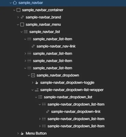
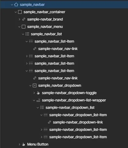
The second point is regarding lists. By default Nav links are links nested in a div Nav Menu with a HTML Tag of Nav. Which correctly establishes the menu as navigation but misses some accessibility that HTML semantic lists add to the table. Features such as assistive devices letting users know how many links there are in the navigation, keeping the heirarchy in regards to navigation links in dropdowns and probably the most important being Lists similarily to ARIA Landmarks can be used by assistive devices to navigate websites. You can read more in the CSS tricks discussion on naviagation markup.
// General best practice HTML 5 Accessible Navigation Structure

<nav>
  <ul>
    <li><a href="#">Home</a></li>
    <li><a href="#">About</a></li>
    <li><a href="#">Clients</a></li>
    <li><a href="#">Contact Us</a></li>
  </ul>
</nav>
This page contains two sample navbars with the desktop versions styled. They handle two main navigation patterns with navigation wrapped in lists. The first is the Navbar with navmenu including a dropdown button. The second is the nav menu that contains a dropdown button and a top level link. They are very similar but the structure is slightly different with a link being added into the Navigation item and text removed from the dropdown toggle.


The Webflow Dropdown
The Webflow Dropdown contains a default div with the HTML tag of Nav applied. It is also has the name Dropdown List but it is not a true list and therefore we have to nest a list inside of it. It is not possible to add List Items inside of it directly. Much like the Nav Menu the Dropdown element has specific styles and properties natively built in that provide needed functionality, so it is recommended to adapt the webflow elements and not try to replace them entirely unless you know how to add in all the functionality that makes them accessible out of the box. This is more than visually being able to open and close them.
As with other elements we can add aria-label to the HTML Nav element or list to give the user a clearer idea of what a particular menu or dropdown list contains.
Using a screen reader is a great way to see the difference Keybpoard focus and Lists additions make to improving the native Webflow Navbar to make it more accessible.